Industry: Film & Digital Photography
Scope: Heirloom Brand + Custom Illustrations
The Goal
Bri came to me with a clear goal:
to elevate her brand for a luxury audience without losing the roots that made it hers.
Her photography is raw, western, and film-forward. The challenge wasn’t reinvention, but refinement that honoured those roots while creating a visual identity that felt confident, timeless, and aligned with high-end clientele who value craft and intention.
The Process
We began with my Brand Journal, a guided discovery process that uncovers the deeper layers of a business. Through reflection and storytelling, Bri shared her values, influences, visual instincts, and long-term vision.
Those insights became the foundation for an Heirloom Brand: a lasting, grounded identity built to grow with her work. From there, we expanded the system with additional custom illustrations to deepen the brand’s narrative and flexibility.
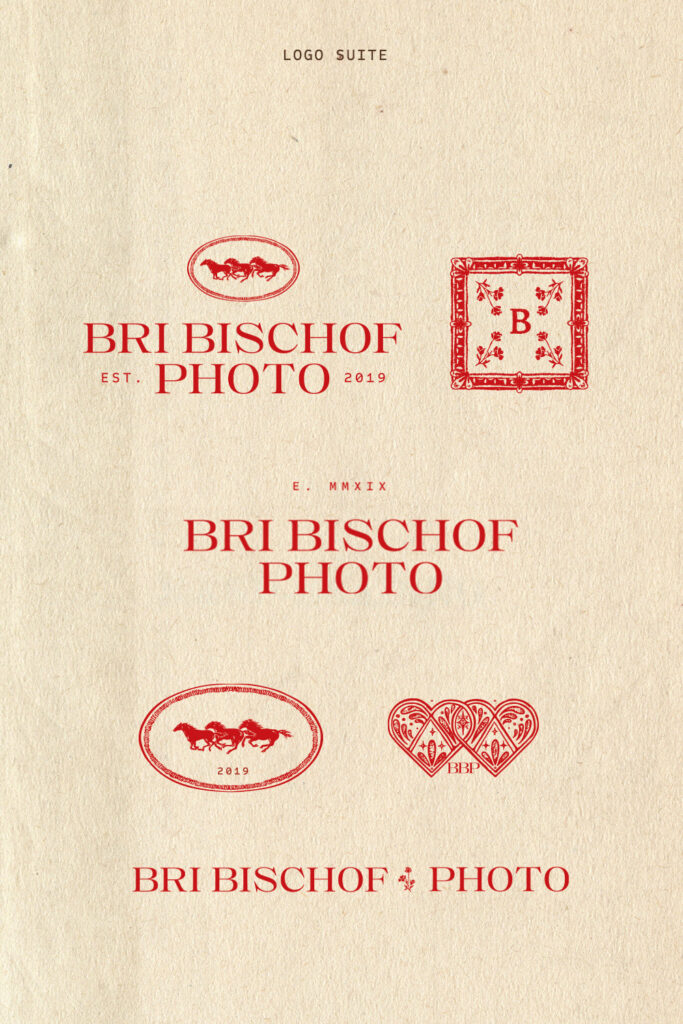
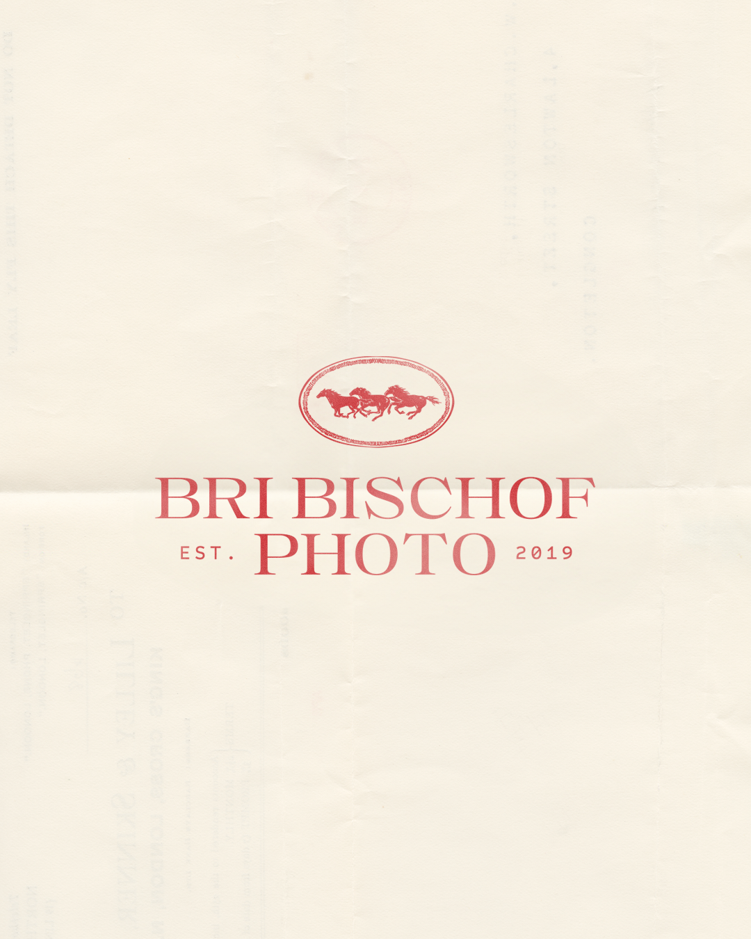
The Brand
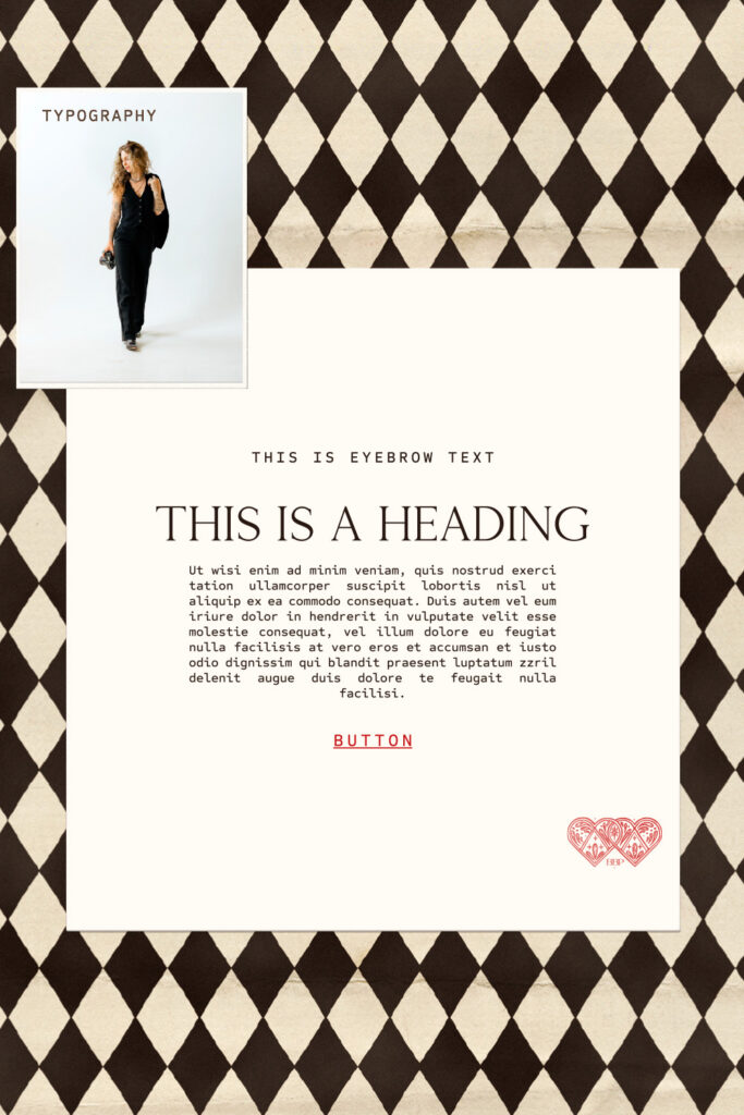
Typography
Custom typography with strong bones and a classic structure creates a sense of quiet confidence and permanence.
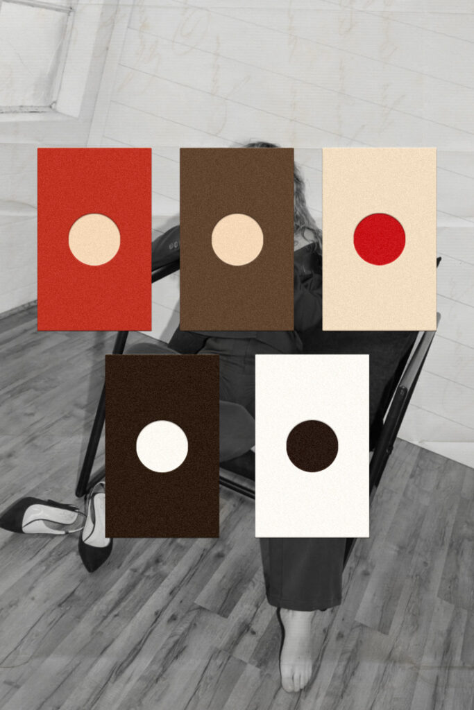
Color Palette
A restrained palette of charcoal, cream, and brown grounds the brand, while a bold pop of red captures Bri’s vibrance and fire.
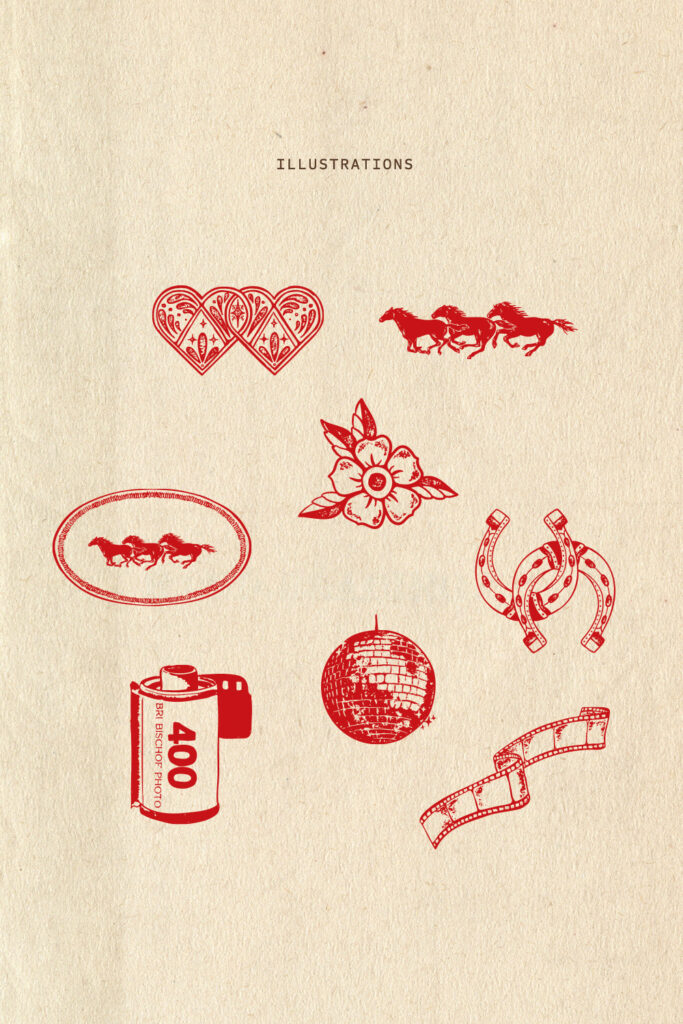
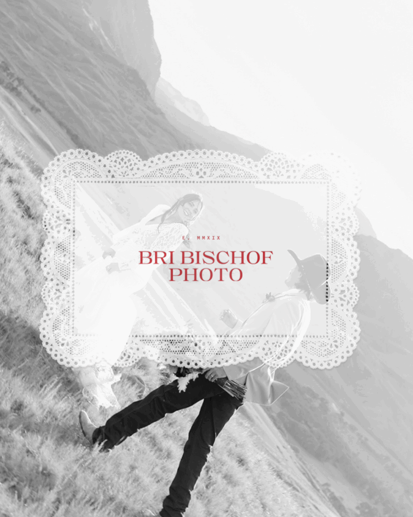
Illustrations
Hand-drawn, textured illustrations add warmth and storytelling. Subtle Americana influences and the inclusion of the poppy, an existing brand symbol, carry forward Bri’s history with intention.
The Outcome
The final brand lives at the intersection of grit and refinement.
It positions Bri’s work for a luxury market without erasing its roots. An identity that feels elevated, expressive, and deeply personal.


