You may have recently purchased a Showit website template, or downloaded my free Link-In-Bio Canvas, and now you’re staring at your screen wondering how to customize it to your brand. Today I’m here to help!
Here are a few key design tips to keep in mind as you customize your little heart out.
First, set your font hierarchy and brand colours in the design settings.
Uploading your brand colours helps create cohesiveness across all your brand’s touch points, and setting up your header, subheader and body fonts in the design settings will save you so much time! A couple things to keep in mind when choosing typography…
Save script fonts for small sections of accent text.
Seriously, please. I’m begging you – do NOT use script (or other funky unique fonts) for paragraph text. Less and less people can easily read cursive these days, which decreases the likelihood of your content actually being read (which decreases your conversions, and we don’t want that!). Make sure your most important pieces of information are in a simple serif or sans-serif font to maximize it’s legibility. And while we’re on the topic of legibility…
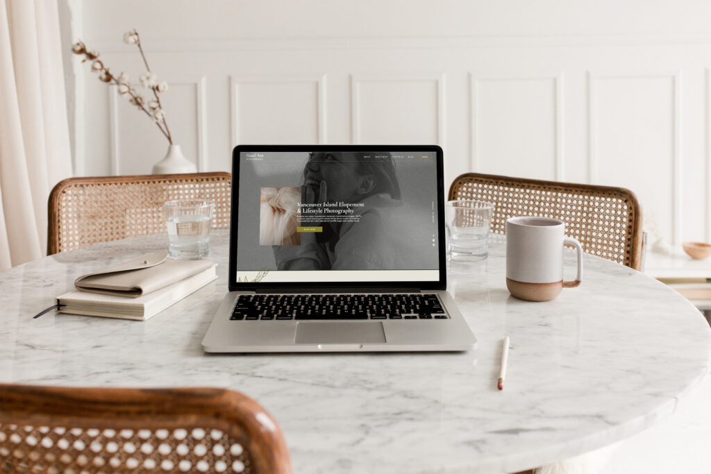
Choose a contrasting colour for text to ensure legibility.
The beige body copy on a lighter beige background may be legible to my 20-something eyes, but that’s probably not the case for everyone. Make sure you have high enough contrast between the text and the background so that your grandma can easily read it. That way we know we’re not the losing people who would have to strain their eyes to read your content!
Negative space is key.
I know it seems like you have so much space to work with, but like Dieter Rams 10th principle “good design is as little design as possible”. Meaning – allow the negative space! It provides breathing room so the design isn’t overstimulating and is easy on the eyes.
Lastly, consider photos play just as important a role as type and colour.
Ever seen a website with those overly posed stock photos that just does not match the vibe at all? Yeah, makes ya cringe a bit doesn’t it? To carry the story through to, not only do you need to consistently use your brand’s typography and colour palette, but you also need to put consideration into photography as well. Even if you don’t have professionally shot, on brand photos, you can still achieve a cohesive look by searching for stock photos that don’t look overly posed, and match the tones found in your brand’s colour palette, as well as the feeling your brand evokes (ie, if your brand is calm, neutral and wise, you wouldn’t use a photo of an excited looking woman in a bright red shirt). This small thing will go such a long way!
Finally, I will leave you with a few of my favourite stock photo sites:
Pexels (you have to sort through the really stocky looking photos, but there’s some gems sprinkled amongst!)
Alright, that’s all for today! But if you are in the throws of customizing your Showit template and need some support, please send me a message and I am happy to assist!
Shop Our Showit Templates Here